Using Colour on Engineering Resumes: Appropriate or Unprofessional?

Are colour resumes in a technical profession like engineering appropriate or unprofessional? All hiring managers have their own preferences. Some adore colourful resumes, while others loathe them. You can’t please everyone, but you can sure try to make majority happy.
I’ve been on both sides of the table. As the desperate engineering student, revising my resume countless times in hopes of landing my first internship. Also as the hiring manager, skimming through hundreds of resumes in search of a suitable hire.
Based on my experience, I’ve noticed that colour can help you stand out. However, if overdone, can appear tacky and unprofessional.
Professional ways to add colour to your resume
Stay away from trendy modern styles

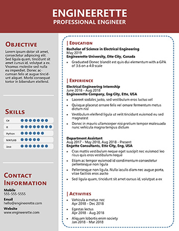
Colours make a resume pop, but some resume styles stand out on another level.
These resumes are loud, artistic, and flashy. In other words, not suitable for engineering.
Trendy colour resumes are good for marketing, web design, sometimes software development. Engineering is relatively conservative compared to these professions, which is why these trendy resumes are generally a bad idea.
As a matter of fact, these styles are also super impractical! Large colour block backgrounds tend to print poorly and have weird margins. Colourful infographics may look cute but don’t provide detailed information.
If you’re feeling daring go for this style, but I prefer to stay on the safe side with resumes.
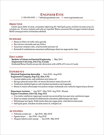
Stick to subtle colour accents

Stand out in a sea of black and white resumes with a pop of colour. These styles do just that without straying too far from the professional traditional look.
Engineering is a relatively conservative field, but adding a pop of colour is usually acceptable. Unlike more conservative professions where black and white resumes are the only acceptable options, engineering has a bit more leeway.
Another major concern with colour resumes is that information may be lost if colours don’t print out properly.
If you choose to use colour for your resume, make sure to follow these general rules:
- stick to one colour and its various tones and shades
- easy-to-print colours is key
- best places for colour are visual objects such as
- line separators
- bullet points
- symbols/icons (phone, email, etc…)
These guidelines ensure that your resume looks professional and no information is lost if colours don’t print out properly.
Finally, remember to pay attention to detail since formatting errors can look even messier when colours are involved.
