Common Engineering Resume Formatting Mistakes
Many talented engineers assume that their experience and projects speak for themselves. This outlook can cost them job opportunities because they overlook the importance of showcasing their skills in a clean and concise manner.
Some engineers refuse to add style to their resume because they believe that they should be hired based on their skills only. This attitude is often reflected in their workplace behavior as well. While there are certainly career paths that work for this mindset, there are many more that don’t.
Style and substance are not mutually exclusive. For every unfashionable engineer in the job market, there is an equally skilled engineer with style. If a candidate can do both, why would a hiring manager not pick them?
Top resume format mistakes
Purchasing resume templates can be a quick and easy solution, but that’s often not enough. Great formatting takes immense attention to detail. Whether or not you bought your resume format or designed it from scratch, these are some things to look out for.
Partially filled page
Resume with unfilled space look incomplete and unbalanced. This issue often occurs when you try to write a two page resume and run out of content to fill up to the end of the second page. In more extreme cases, such as first time resume writers, they may not even have enough content to fill up a single page.
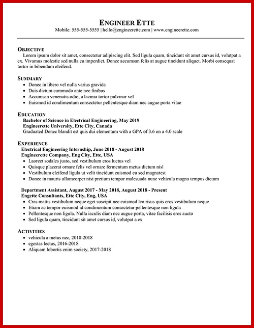
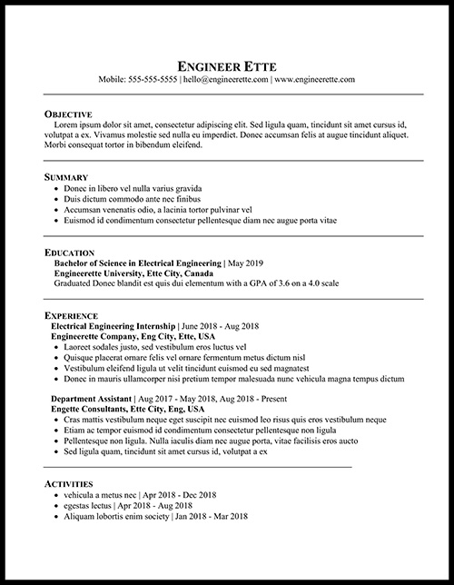
Both resumes above have the exact same content but different formatting. The first resume has trailing white space at the bottom, giving the resume an unfinished look. To fix this up, the following items were adjusted:
- increase margins
- add horizontal separator lines
- increase header font size
The second resume appears more complete and full despite having the exact same content as the first.
Unparseable text
It’s no secret that majority of preliminary resume screening is automated these days. Because of this, it is crucial that your resume is able to be parsed. Some companies accept a variety of file formats, from TXT, DOCX, PDF, and even JPG. My preferred file format would be PDF since it retains the intended format and is typically parse-able.
A simple check to see if your PDF resume is readable is to select and copy the text and paste it into notepad. This strips the resume content down to its bare bones and is how the computer will process it. Make sure keywords are searchable in the notepad version.
This usually isn’t an issue, especially if you use Microsoft Word to build your resume. In the past, I’ve ran into this issue when I picked fancier fonts that weren’t commonly supported and built my resume with LaTeX. If you really want to be creative with your fonts, the selection in Google Fonts is usually very reliable and can be parsed.
Unexplained technical acronyms and abbreviations
Continuing on from the angle of automated resumes screening, it’s advantageous to include both acronym and expanded keywords. Additionally, hiring managers who may not have the same technical background can get some context. A good system to follow is expanding out the acronym the first time it is used, and then using only the acronym from there on.
Use your judgement for which acronyms need to be expanded. Abbreviations such as Energy Management System (EMS) or Entity Frame work (EF) is niche enough to be written out fully. On the other hand, things that are known primarily by their abbreviations such as Random Access Memory (RAM) and Hypertext Markup Language (HTML) may seem a bit excessive to expand.
Orphan lines
Orphan lines are one or two words left alone on its own lines. It’s an inefficient use of paper space and is not aesthetically pleasing.
This issue is most commonly resolved by rewording. If rephrasing is not a viable option, then looking into different font sizes or style is a secondary option.
Formatting inconsistencies
Make sure everything of same type are formatted in a uniform fashion. Common errors include:
- different styles for heading
- inconsistent date format (Jan 2019 vs Jan. 2019 vs January 2019)
- misaligned objects
These may seem like small issues, but they stick out like a sore thumb upon closer reading.
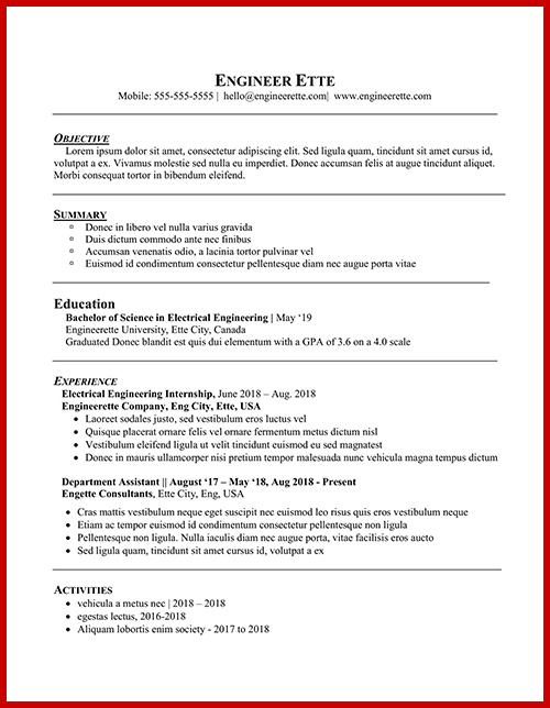
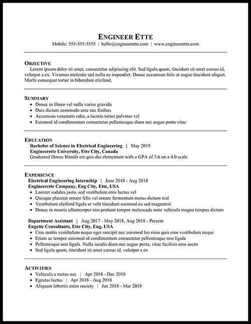
Inconsistent formatting looks messy and disorganized and this can speak volumes about the candidate.
Uneven distribution of bullet points
Not all experiences are equal, but don’t make it that obvious. Your engineering internship is certainly going to have more noteworthy points than your time as a grocery clerk. However, it doesn’t look good if one experience is seven bullet points long while another only has one bullet point.
If this is a situation you are currently faced with, consider whether or not the latter experience is even worth listing in your resume. If it is, then surely it’s possible to bring up a couple more achievements to balance out the weight of each experience.
Overusing caps, bold, italics, and underline for emphasis
Headers require extra emphasis to draw the reader’s attention, but it’s easy to get carried away. Stacking on capital letters, bold, italics, and underline looks extremely tacky. Stacking on at most two styles is usually enough to make the header pop without the cluttered look.
Poor colour choices
Colour resumes are a touchy topic for many. Some love it, some hate it. Many traditional fields (electrical, civil, mechanical) have remained black and white, while newer fields (web design, software) welcome colourful resumes with open arms. That being said, even for traditional engineering fields, a touch of colour usually isn’t detrimental to the job search process.
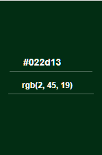
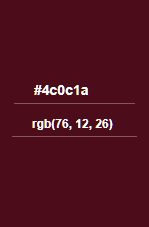
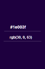

If you choose to add colour to your resume, sticking to one accent colour is usually a safe bet. Especially if the accent colour is used for text, make sure the colour is easy to read when printed in black and white.
